728x90
📕 변환이란?
- 플러그인의 도움 없이 웹 브라우저에 3차원 공간을 구현할 수 있게 되었음
- HTML5에서 3차원을 구현하는 방법은 크게 2가지
- 자바스크립트를 사용한 webGL
- CSS3를 사용한 3차원 배열
📕 2차원 배열
- 대부분의 컴퓨터 프로그램은 화면 좌표를 이용
- X축과 Y축이 있는 화면 좌표를 2차원 화면 좌표라고 부름
- Z축을 추가하면 3차원 화면 좌표로 확장
- 3차원 화면 좌표에서 Z축은 웹 브라우저를 보는 사용자에게 가까울수록 큰 값임
📕 transform 속성
- CSS3부터는 transform 속성을 사용해 객체를 변환할 수 있음
- 변환이 가능한 이야기는 HTML 페이지 스스로 애니메이션 같은 플래시 콘텐츠를 만들 수 있음
<!DOCTYPE html>
<html>
<head>
    <title>Document</title>
    <style>
        section {
            width: 100px; height: 100px;
            border: 5px solid black;
        }
        div{
            width: 100px; height: 100px;
            background-color: red;

            transform: rotate(60deg);
        }
    </style>
</head>
<body>
    <section>
        <div></div>
    </section>
</body>
</html>
- 코드를 실행하면 사각형이 60도 회전
📕 2차원 변환 함수
- 프로그래밍 언어에서는 식별자 뒤에 괄호가 있을 경우 해당 식별자를 함수라고 부름
- transform 속성 안에 함수 사용
| translate(transiateX, translateY | 특정 크기만큼 이동 |
| translateX(translateX) | x축으로 특정 크기만큼 이동 |
| translateY(translateY) | y축으로 특정 크기만큼 이동 |
| scale(scaleX, scaleY) | 특정 크기만큼 확대 및 축소 |
| scaleX(scaleX) | x축으로 특정 크기만큼 확대 및 축소 |
| scaleY(scaleY) | y축으로 특정 크기만큼 확대 및 축소 |
| skew(angleX, angleY) | 특정 각도만큼 기울임 |
| skewX(angleX) | x축으로 특정 각도만큼 기울임 |
| skewY(angleY) | y축으로 특정 각도만큼 기울임 |
| rotate(angleZ) | 특정 각도만큼 회전 |
- transform 속성에 각각의 함수를 공백으로 구분해 입력하면됨
📕 transform-origin 속성
- 변환 중심을 설정하는 스타일 속성
- 태그 영역의 중심을 변환 중심으로 잡음
<!DOCTYPE html>
<html>
<head>
    <title>Document</title>
    <style>
        section {
            width: 100px;
            height: 100px;
            border: 5px solid black;
        }
        div{
            width: 100px; height: 100px;
            background-color: red;

            transform: rotate(60deg);
        }
    </style>
</head>
<body>
    <section>
        <div></div>
    </section>
</body>
</html>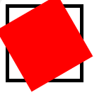
- rotate() 변환 함수를 사용하였으므로 사각형이 60도 회전
- 사각형의 중심을 기준으로 회전
- 변환 중심을 변경할 때 transform-origin 속성 사용
- 2개의 크기 단위 적용 가능
- 각각 변환 중심의 X좌표와 Y좌표 의미
<!DOCTYPE html>
<html>
<head>
    <title>Document</title>
    <style>
        section {
            width: 100px;
            height: 100px;
            border: 5px solid black;
        }
        div{
            width: 100px; height: 100px;
            background-color: red;

            transform: rotate(60deg);
            transform-origin: 100% 100%;
        }
    </style>
</head>
<body>
    <section>
        <div></div>
    </section>
</body>
</html>
📕 3차원 변환 함수
| translate(translateX, translateY, translateZ) | 특정 크기만큼 이동 | rotateY(angleY) | y축으로 특정 각도만큼 회전 |
| translateX(translateX) | x축으로 특정 크기만큼 이동 | rotateZ(angleZ) | z축으로 특정 각도만큼 회전 |
| translateY(translateY) | y축으로 특정 크기만큼 이동 | ||
| translateZ(translateZ) | z축으로 특정 크기만큼 이동 | ||
| scale3d(scaleX, scaleY, scaleZ) | 특정 크기만큼 확대 및 축소 | ||
| scaleX(scaleX) | x축으로 특정 크기만큼 확대 및 축소 | ||
| scaleY(scaleY) | y축으로 특정 크기만큼 확대 및 축소 | ||
| scaleZ(scaleZ) | z축으로 특정 크기만큼 확대 및 축소 | ||
| rotate3d(angleX, angleY, angleZ) | 특정 각도만큼 회전 | ||
| rotateX(angleX) | x축으로 특정 각도만큼 회전 |
- section 태그로 감싸 하나의 객체처럼 만듬
- div 태그의 position 속성에 absolute 키워드를 적용하고 left 속성과 top 속성을 사용해 하나로 뭉침
- 각각의 태그를 적당한 각도로 회전시키고 외곽으로 밀어버림
<!DOCTYPE html>
<html>
<head>
    <title>Document</title>
    <style>
        body {
            width: 200px;
            margin: 200px auto;
        }
        section {
            width: 200px; height: 200px;
            position: relative;
        }
        div {
            width: 200px; height: 200px;
            position: absolute; left: 0; top: 0;
            opacity: 0.3;
        }
        /* 옆면 */
        div:nth-child(1) {transform: rotate(0deg) translate3d(0px, 0px, 100px);}
        div:nth-child(2) {transform: rotate(90deg) translate3d(0px, 0px, 100px);}
        div:nth-child(3) {transform: rotate(180deg) translate3d(0px, 0px, 100px);}
        div:nth-child(4) {transform: rotate(270deg) translate3d(0px, 0px, 100px);}
        /* 윗면과 아랫면 */
        div:nth-child(5) {transform: rotate(90deg) translate3d(0px, 0px, 100px);}
        div:nth-child(6) {transform: rotate(270deg) translate3d(0px, 0px, 100px);}
    </style>
</head>
<body>
    <section>
        <div></div>
        <div></div>
        <div></div>
        <div></div>
        <div></div>
        <div></div>
    </section>
</body>
</html>- 각각의 div 태그에 색상 입력
<!DOCTYPE html>
<html>
<head>
    <title>Document</title>
    <style>
        body {
            width: 200px;
            margin: 200px auto;
        }
        section {
            width: 200px; height: 200px;
            position: relative;
        }
        div {
            width: 200px; height: 200px;
            position: absolute; left: 0; top: 0;
            opacity: 0.3;
        }
        /* 옆면 */
        div:nth-child(1) {
            transform: rotateY(0deg) translate3d(0px, 0px, 100px);
            background: red;
        }
        div:nth-child(2) {
            transform: rotateY(90deg) translate3d(0px, 0px, 100px);
            background: green;
        }
        div:nth-child(3) {
            transform: rotateY(180deg) translate3d(0px, 0px, 100px);
            background: blue;
        }
        div:nth-child(4) {
            transform: rotateY(270deg) translate3d(0px, 0px, 100px);
            background: yellow;
        }
        /* 윗면과 아랫면 */
        div:nth-child(5) {
            transform: rotateX(90deg) translate3d(0px, 0px, 100px);
            background: brown;
        }
        div:nth-child(6) {
            transform: rotateX(270deg) translate3d(0px, 0px, 100px);
            background: pink;
        }
    </style>
</head>
<body>
    <section>
        <div></div>
        <div></div>
        <div></div>
        <div></div>
        <div></div>
        <div></div>
    </section>
</body>
</html>
📕 transform-style 속성
- 변환을 적용할 때 그 영향력이 자신에게만 적용될지 자손에게도 적용될 지 정하는 속성
<!DOCTYPE html>
<html>
<head>
    <title>Document</title>
    <style>
        body {
            width: 200px;
            margin: 200px auto;
        }
        section {
            width: 200px; height: 200px;
            position: relative;
            animation: rint 3s linear 0s infinite;
        }
        @keyframes rint{
            from{
                transform: rotateX(0deg) rotateY(0deg) rotateZ(0deg);
            }
            to{
                transform: rotateX(360deg) rotateY(360deg) rotateZ(360deg);
            }
        }
        div {
            width: 200px; height: 200px;
            position: absolute; left: 0; top: 0;
            opacity: 0.3;
        }
        /* 옆면 */
        div:nth-child(1) {
            transform: rotateY(0deg) translate3d(0px, 0px, 100px);
            background: red;
        }
        div:nth-child(2) {
            transform: rotateY(90deg) translate3d(0px, 0px, 100px);
            background: green;
        }
        div:nth-child(3) {
            transform: rotateY(180deg) translate3d(0px, 0px, 100px);
            background: blue;
        }
        div:nth-child(4) {
            transform: rotateY(270deg) translate3d(0px, 0px, 100px);
            background: yellow;
        }
        /* 윗면과 아랫면 */
        div:nth-child(5) {
            transform: rotateX(90deg) translate3d(0px, 0px, 100px);
            background: brown;
        }
        div:nth-child(6) {
            transform: rotateX(270deg) translate3d(0px, 0px, 100px);
            background: pink;
        }
    </style>
</head>
<body>
    <section>
        <div></div>
        <div></div>
        <div></div>
        <div></div>
        <div></div>
        <div></div>
    </section>
</body>
</html>- 정육면체를 담고 있는 틀이 움직이므로 정육면체가 움직일 것이라고 기대할 수 있지만 평면이 회전
- 자손의 3차원 속성을 유지한 채로 부모를 회전시키고 싶을 때는 부모의 transform-style 속성에 preserve-3d 키워드 적용
- section 태그의 trandform-style 속성에 preserve-3d 키워드를 적용
<!DOCTYPE html>
<html>
<head>
    <title>Document</title>
    <style>
        body {
            width: 200px;
            margin: 200px auto;
        }
        section {
            width: 200px; height: 200px;
            position: relative;
            animation: rint 3s linear 0s infinite;

            transform-style: preserve-3d;
        }
        @keyframes rint{
            from{
                transform: rotateX(0deg) rotateY(0deg) rotateZ(0deg);
            }
            to{
                transform: rotateX(360deg) rotateY(360deg) rotateZ(360deg);
            }
        }
        div {
            width: 200px; height: 200px;
            position: absolute; left: 0; top: 0;
            opacity: 0.3;
        }
        /* 옆면 */
        div:nth-child(1) {
            transform: rotateY(0deg) translate3d(0px, 0px, 100px);
            background: red;
        }
        div:nth-child(2) {
            transform: rotateY(90deg) translate3d(0px, 0px, 100px);
            background: green;
        }
        div:nth-child(3) {
            transform: rotateY(180deg) translate3d(0px, 0px, 100px);
            background: blue;
        }
        div:nth-child(4) {
            transform: rotateY(270deg) translate3d(0px, 0px, 100px);
            background: yellow;
        }
        /* 윗면과 아랫면 */
        div:nth-child(5) {
            transform: rotateX(90deg) translate3d(0px, 0px, 100px);
            background: brown;
        }
        div:nth-child(6) {
            transform: rotateX(270deg) translate3d(0px, 0px, 100px);
            background: pink;
        }
    </style>
</head>
<body>
    <section>
        <div></div>
        <div></div>
        <div></div>
        <div></div>
        <div></div>
        <div></div>
    </section>
</body>
</html>- 정육면체가 회전
- transform-style 속성에는 이와 같은 키워드 사용
| flat | 후손의 3차원 속성 무시 |
| preserve-3d | 후손의 3차원 속성 유지 |
📕 backface-visibility 속성
- 3차원 공간에서 평면의 후면을 보이거나 보이지 않게 만드는 스타일 속성
- div 태그에 backface-visibility 속성에 hidden 키워드 적용
<!DOCTYPE html>
<html>
<head>
    <title>Document</title>
    <style>
        body {
            width: 200px;
            margin: 200px auto;
        }
        section {
            width: 200px; height: 200px;
            position: relative;
            animation: rint 3s linear 0s infinite;

            transform-style: preserve-3d;
        }
        @keyframes rint{
            from{
                transform: rotateX(0deg) rotateY(0deg) rotateZ(0deg);
            }
            to{
                transform: rotateX(360deg) rotateY(360deg) rotateZ(360deg);
            }
        }
        div {
            width: 200px; height: 200px;
            position: absolute; left: 0; top: 0;

            backface-visibility: hidden;
            opacity: 0.3;
        }
        /* 옆면 */
        div:nth-child(1) {
            transform: rotateY(0deg) translate3d(0px, 0px, 100px);
            background: red;
        }
        div:nth-child(2) {
            transform: rotateY(90deg) translate3d(0px, 0px, 100px);
            background: green;
        }
        div:nth-child(3) {
            transform: rotateY(180deg) translate3d(0px, 0px, 100px);
            background: blue;
        }
        div:nth-child(4) {
            transform: rotateY(270deg) translate3d(0px, 0px, 100px);
            background: yellow;
        }
        /* 윗면과 아랫면 */
        div:nth-child(5) {
            transform: rotateX(90deg) translate3d(0px, 0px, 100px);
            background: brown;
        }
        div:nth-child(6) {
            transform: rotateX(270deg) translate3d(0px, 0px, 100px);
            background: pink;
        }
    </style>
</head>
<body>
    <section>
        <div></div>
        <div></div>
        <div></div>
        <div></div>
        <div></div>
        <div></div>
    </section>
</body>
</html>- 평면의 후면이 사라진 것을 확인할 수 있음
- 이와 같은 키워드 사용
| visible | 후면을 보이게 만듬 |
| hidden | 후면을 보이지 않게 만듬 |
📕 원근법
- perspective 속성은 원근법을 지정하는 속성
- perspective 속성은 화면에 얼마나 많은 3차원 픽셀을 놓을 것인지 정의하는 속성
- perspective 속성에는 400픽셀에서 2000픽셀 사이의 숫자 입력
- body 태그에 perspective 속성값 400 적용
<!DOCTYPE html>
<html>
<head>
    <title>Document</title>
    <style>
        body {
            width: 200px;
            margin: 200px auto;
            -webkit-perspective: 400;
        }
        section {
            width: 200px; height: 200px;
            position: relative;
            animation: rint 3s linear 0s infinite;

            transform-style: preserve-3d;
        }
        @keyframes rint{
            from{
                transform: rotateX(0deg) rotateY(0deg) rotateZ(0deg);
            }
            to{
                transform: rotateX(360deg) rotateY(360deg) rotateZ(360deg);
            }
        }
        div {
            width: 200px; height: 200px;
            position: absolute; left: 0; top: 0;

            backface-visibility: hidden;
            opacity: 0.3;
        }
        /* 옆면 */
        div:nth-child(1) {
            transform: rotateY(0deg) translate3d(0px, 0px, 100px);
            background: red;
        }
        div:nth-child(2) {
            transform: rotateY(90deg) translate3d(0px, 0px, 100px);
            background: green;
        }
        div:nth-child(3) {
            transform: rotateY(180deg) translate3d(0px, 0px, 100px);
            background: blue;
        }
        div:nth-child(4) {
            transform: rotateY(270deg) translate3d(0px, 0px, 100px);
            background: yellow;
        }
        /* 윗면과 아랫면 */
        div:nth-child(5) {
            transform: rotateX(90deg) translate3d(0px, 0px, 100px);
            background: brown;
        }
        div:nth-child(6) {
            transform: rotateX(270deg) translate3d(0px, 0px, 100px);
            background: pink;
        }
    </style>
</head>
<body>
    <section>
        <div></div>
        <div></div>
        <div></div>
        <div></div>
        <div></div>
        <div></div>
    </section>
</body>
</html>- 정육면체가 회전
- 입체감이 느껴지는 정육면체가 됨
📕 회전목마 - body 태그 구성
- 간단한 소개 페이지와 회전 목마를 올려둘 div 태그를 만들고 id 속성값으로 canvas에 입력
<!DOCTYPE html>
<html lang="en">
<head>
    <title>Document</title>
    <style>

    </style>
</head>
<body>
    <h1>HTML5 + CSS3 for Modern Web</h1>
    <h2>CSS transform</h2>
    <p>3D Merry Go Round Gallery</p>
    <hr/>
    <div id="canvas">

    </div>
</body>
</html>- 회전 목마 열 생성
- 회전 목마의 수는 10개
<!DOCTYPE html>
<html lang="en">
<head>
    <title>Document</title>
    <style>

    </style>
</head>
<body>
    <h1>HTML5 + CSS3 for Modern Web</h1>
    <h2>CSS transform</h2>
    <p>3D Merry Go Round Gallery</p>
    <hr/>
    <div id="canvas">
        <div id="merry">
            <div class="face"></div>
            <div class="face"></div>
            <div class="face"></div>
            <div class="face"></div>
            <div class="face"></div>
            <div class="face"></div>
            <div class="face"></div>
            <div class="face"></div>
            <div class="face"></div>
            <div class="face"></div>
        </div>
    </div>
</body>
</html>- #canvas 태그는 단지 회전 목마 객체를 적당한 위치에 놓기 위해 만든 태그
- #merry 태그는 회전 목마 객체 의미
- 내부의 열에 각각의 셀을 입력
- class 속성값으로 face를 부여한 div 태그에 div 태그를 4개씩 놓고 class 속성값으로 cell 입력
<!DOCTYPE html>
<html lang="en">
<head>
    <title>Document</title>
    <style>

    </style>
</head>
<body>
    <h1>HTML5 + CSS3 for Modern Web</h1>
    <h2>CSS transform</h2>
    <p>3D Merry Go Round Gallery</p>
    <hr/>
    <div id="canvas">
        <div id="merry">
            <div class="face">
                <div class="cell"></div>
                <div class="cell"></div>
                <div class="cell"></div>
                <div class="cell"></div>
            </div>
            <div class="face">
                <div class="cell"></div>
                <div class="cell"></div>
                <div class="cell"></div>
                <div class="cell"></div>
            </div>
            <div class="face">
                <div class="cell"></div>
                <div class="cell"></div>
                <div class="cell"></div>
                <div class="cell"></div>
            </div>
            <div class="face">
                <div class="cell"></div>
                <div class="cell"></div>
                <div class="cell"></div>
                <div class="cell"></div>
            </div>
            <div class="face">
                <div class="cell"></div>
                <div class="cell"></div>
                <div class="cell"></div>
                <div class="cell"></div>
            </div>
            <div class="face">
                <div class="cell"></div>
                <div class="cell"></div>
                <div class="cell"></div>
                <div class="cell"></div>
            </div>
            <div class="face">
                <div class="cell"></div>
                <div class="cell"></div>
                <div class="cell"></div>
                <div class="cell"></div>
            </div>
            <div class="face">
                <div class="cell"></div>
                <div class="cell"></div>
                <div class="cell"></div>
                <div class="cell"></div>
            </div>
            <div class="face">
                <div class="cell"></div>
                <div class="cell"></div>
                <div class="cell"></div>
                <div class="cell"></div>
            </div>
            <div class="face">
                <div class="cell"></div>
                <div class="cell"></div>
                <div class="cell"></div>
                <div class="cell"></div>
            </div>
        </div>
    </div>
</body>
</html>
📕 회전목마 - 스타일 사용
- 모든 스타일 사용의 시작은 초기화
- 모든 태그의 margin 속성과 padding 속성을 초기화하고 html 태그와 body 태그의 height 속성도 초기화
- 회전 목마 내부의 열과 셀의 위치를 잡아봄
<!DOCTYPE html>
<html lang="en">
<head>
    <title>Document</title>
    <style>
        * {margin: 0; padding: 0;}
        html, body {height: 100%;}
        body {
            width: 600px;
            margin: 0 auto;
        }
        #canvas {
            position: absolute;
            width: 100px; height: 200px;
            -webkit-perspective: 1500;
        }
        #merry {
            position: absolute;
            left: 50%; top: 50%;
            transform-style: preserve-3d;
        }
        .face {
            position: absolute;
            left: 0; top: 0;
            margin-left: -115px;

            backface-visibility: hidden;
            transform-style: preserve-3d;
        }
        .cell {
            width: 230px; height: 150px;
            margin-bottom: 5px;
            background: url('http://placehold.it/260x200');
            background-size: 100% 100%;

            transition-duration: 0.5s;
        }
        .face:nth-child(1) {transform: rotate(0deg) translateZ(-370px);}
        .face:nth-child(2) {transform: rotate(36deg) translateZ(-370px);}
        .face:nth-child(3) {transform: rotate(72deg) translateZ(-370px);}
        .face:nth-child(4) {transform: rotate(108deg) translateZ(-370px);}
        .face:nth-child(5) {transform: rotate(144deg) translateZ(-370px);}
        .face:nth-child(6) {transform: rotate(180deg) translateZ(-370px);}
        .face:nth-child(7) {transform: rotate(216deg) translateZ(-370px);}
        .face:nth-child(8) {transform: rotate(252deg) translateZ(-370px);}
        .face:nth-child(9) {transform: rotate(288deg) translateZ(-370px);}
        .face:nth-child(10) {transform: rotate(324deg) translateZ(-370px);}
        .cell:hover{
            transform: scale(1.2) translateZ(50px);
        }
    </style>
</head>
<body>
    <h1>HTML5 + CSS3 for Modern Web</h1>
    <h2>CSS transform</h2>
    <p>3D Merry Go Round Gallery</p>
    <hr/>
    <div id="canvas">
        <div id="merry">
            <div class="face">
                <div class="cell"></div>
                <div class="cell"></div>
                <div class="cell"></div>
                <div class="cell"></div>
            </div>
            <div class="face">
                <div class="cell"></div>
                <div class="cell"></div>
                <div class="cell"></div>
                <div class="cell"></div>
            </div>
            <div class="face">
                <div class="cell"></div>
                <div class="cell"></div>
                <div class="cell"></div>
                <div class="cell"></div>
            </div>
            <div class="face">
                <div class="cell"></div>
                <div class="cell"></div>
                <div class="cell"></div>
                <div class="cell"></div>
            </div>
            <div class="face">
                <div class="cell"></div>
                <div class="cell"></div>
                <div class="cell"></div>
                <div class="cell"></div>
            </div>
            <div class="face">
                <div class="cell"></div>
                <div class="cell"></div>
                <div class="cell"></div>
                <div class="cell"></div>
            </div>
            <div class="face">
                <div class="cell"></div>
                <div class="cell"></div>
                <div class="cell"></div>
                <div class="cell"></div>
            </div>
            <div class="face">
                <div class="cell"></div>
                <div class="cell"></div>
                <div class="cell"></div>
                <div class="cell"></div>
            </div>
            <div class="face">
                <div class="cell"></div>
                <div class="cell"></div>
                <div class="cell"></div>
                <div class="cell"></div>
            </div>
            <div class="face">
                <div class="cell"></div>
                <div class="cell"></div>
                <div class="cell"></div>
                <div class="cell"></div>
            </div>
        </div>
    </div>
</body>
</html>
📕 회전목마 - 애니메이션 적용
- 회전 목마가 회전이 가능하도록 애니메이션 적용
- #merry 선택자에 animation 속성 사용
- 애니메이션 이름은 rint이고 15초 동안 무한 반복
- 애니메이션 이름에 rint를 입력했으므로 rint 키 프레임 생성
- 키 프레임을 생성하여 15초 동안 한 바퀴를 돌게 만듬
<!DOCTYPE html>
<html lang="en">
<head>
    <title>Document</title>
    <style>
        * {margin: 0; padding: 0;}
        html, body {height: 100%;}
        body {
            width: 600px;
            margin: 0 auto;
        }
        #canvas {
            position: relative;
            width: 100px; height: 200px;
            -webkit-perspective: 1500px;
        }
        #merry {
            position: absolute;
            left: 50%; top: 30%;

            transform-style: preserve-3d;
            animation: rint 15s infinite linear;
        }
        @keyframes rint{
            from {transform: rotate(0deg)}
            to{transform: rotate(360deg);}
        }
        .face {
            position: absolute;
            left: 0; top: 0;
            margin-left: -115px;

            backface-visibility: hidden;
            transform-style: preserve-3d;
        }
        .cell {
            width: 230px; height: 150px;
            margin-bottom: 5px;
            background: url('http://placehold.it/260x200');
            background-size: 100% 100%;

            transition-duration: 0.5s;
        }
        .face:nth-child(1) {transform: rotate(0deg) translateZ(-370px);}
        .face:nth-child(2) {transform: rotate(36deg) translateZ(-370px);}
        .face:nth-child(3) {transform: rotate(72deg) translateZ(-370px);}
        .face:nth-child(4) {transform: rotate(108deg) translateZ(-370px);}
        .face:nth-child(5) {transform: rotate(144deg) translateZ(-370px);}
        .face:nth-child(6) {transform: rotate(180deg) translateZ(-370px);}
        .face:nth-child(7) {transform: rotate(216deg) translateZ(-370px);}
        .face:nth-child(8) {transform: rotate(252deg) translateZ(-370px);}
        .face:nth-child(9) {transform: rotate(288deg) translateZ(-370px);}
        .face:nth-child(10) {transform: rotate(324deg) translateZ(-370px);}
        .cell:hover{
            transform: scale(1.2) translateZ(50px);
        }
    </style>
</head>
<body>
    <h1>HTML5 + CSS3 for Modern Web</h1>
    <h2>CSS transform</h2>
    <p>3D Merry Go Round Gallery</p>
    <hr/>
    <div id="canvas">
        <div id="merry">
            <div class="face">
                <div class="cell"></div>
                <div class="cell"></div>
                <div class="cell"></div>
                <div class="cell"></div>
            </div>
            <div class="face">
                <div class="cell"></div>
                <div class="cell"></div>
                <div class="cell"></div>
                <div class="cell"></div>
            </div>
            <div class="face">
                <div class="cell"></div>
                <div class="cell"></div>
                <div class="cell"></div>
                <div class="cell"></div>
            </div>
            <div class="face">
                <div class="cell"></div>
                <div class="cell"></div>
                <div class="cell"></div>
                <div class="cell"></div>
            </div>
            <div class="face">
                <div class="cell"></div>
                <div class="cell"></div>
                <div class="cell"></div>
                <div class="cell"></div>
            </div>
            <div class="face">
                <div class="cell"></div>
                <div class="cell"></div>
                <div class="cell"></div>
                <div class="cell"></div>
            </div>
            <div class="face">
                <div class="cell"></div>
                <div class="cell"></div>
                <div class="cell"></div>
                <div class="cell"></div>
            </div>
            <div class="face">
                <div class="cell"></div>
                <div class="cell"></div>
                <div class="cell"></div>
                <div class="cell"></div>
            </div>
            <div class="face">
                <div class="cell"></div>
                <div class="cell"></div>
                <div class="cell"></div>
                <div class="cell"></div>
            </div>
            <div class="face">
                <div class="cell"></div>
                <div class="cell"></div>
                <div class="cell"></div>
                <div class="cell"></div>
            </div>
        </div>
    </div>
</body>
</html>
'Front > CSS' 카테고리의 다른 글
| [CSS3] 추가 규칙 (0) | 2024.07.07 |
|---|---|
| [CSS3] CSS3 변형과 애니메이션 (0) | 2024.07.02 |
| [CSS3] CSS 스타일 속성 (0) | 2024.07.02 |
| [CSS3] CSS 선택자 (1) | 2024.06.30 |